Making Membership Memorable
PROJECT COMPLETED: NOVEMBER 2025
THE REQUEST
As part of a growth initiative, the team at un:hurd music was tasked with improving our membership offering to increase revenue.
THE OUTCOME
User research was conducted with both existing and lapsed members, from which we learned our membership value was unclear. To combat this and increase conversion we implemented several updates including a paywall redesign, guidance for members on what to do after subscription, and clearer messaging around the features they had unlocked. The paywall updates increased conversion by 23% on iOS, but interestingly decreased conversion by 11% on web (although this result did not reach statistical significance). Hypotheses and learnings from this are discussed.
THE CHALLENGE
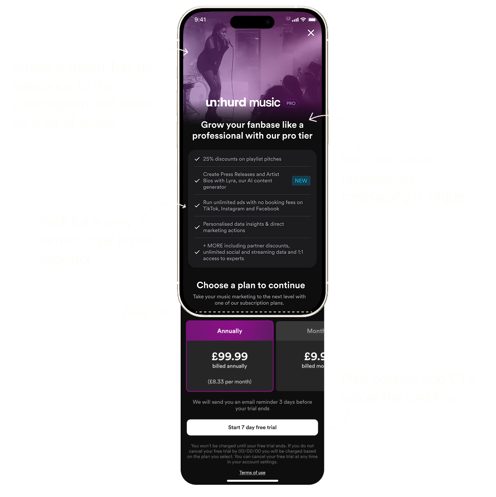
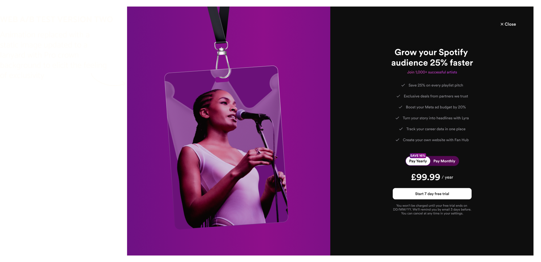
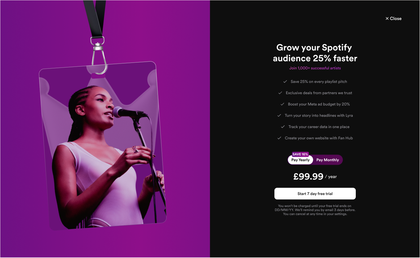
un:hurd music is a marketing solution for musicians, allowing them to manage their marketing from one place with a suite of promotional tools such as playlist pitching, social media ads and AI PR assitants for writing bio's and press releases.

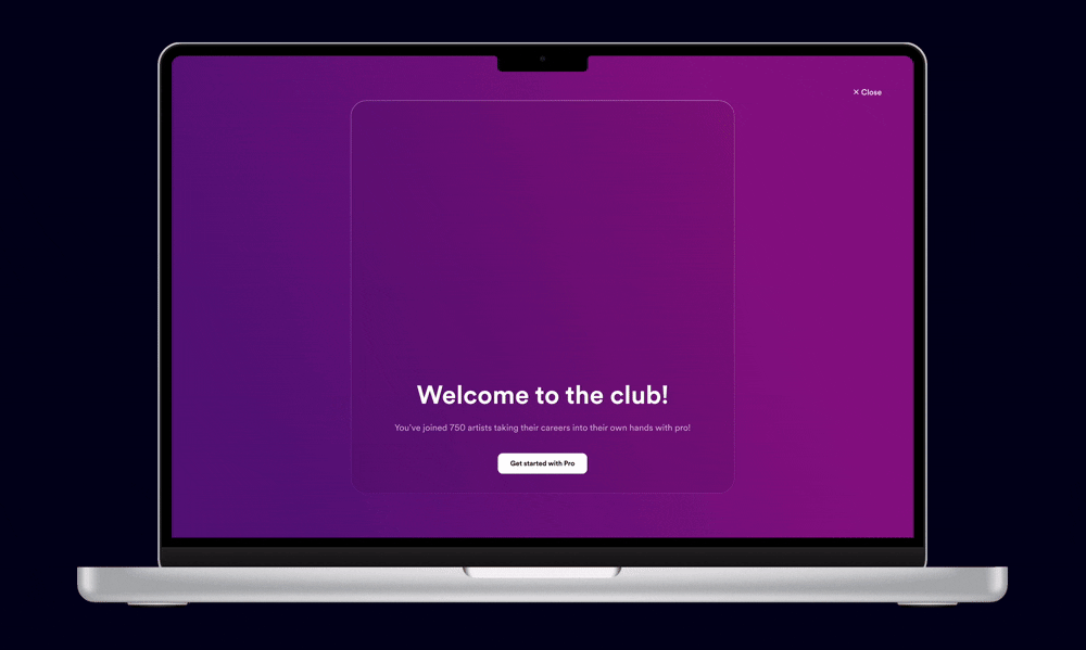
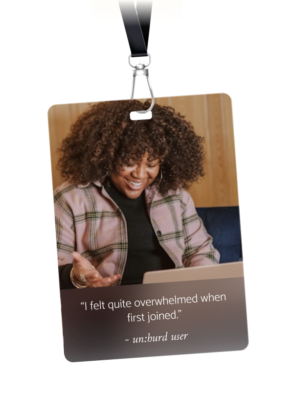
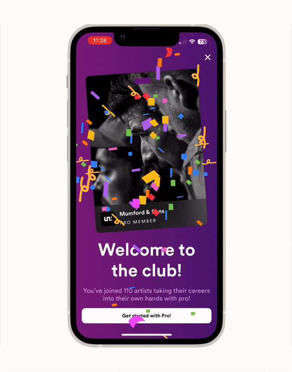
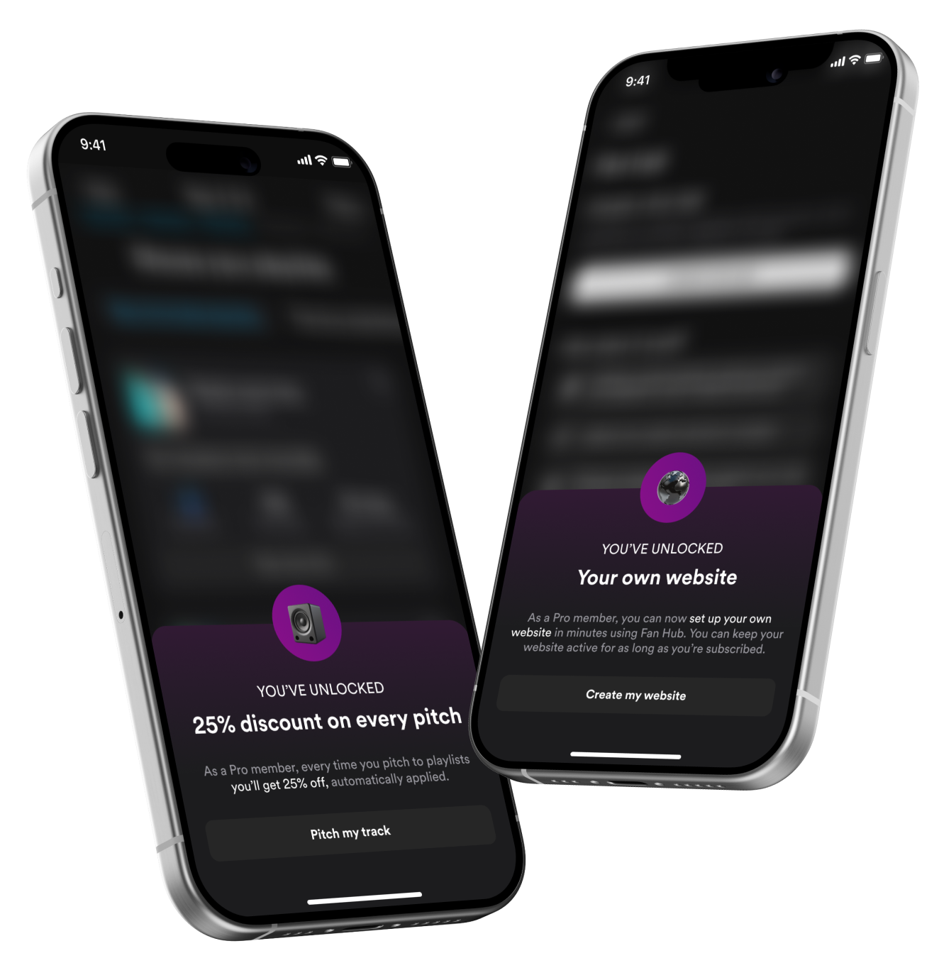
When I was a very new designer, un:hurd leadership decided to introduce a membership. Some features went entirely behind a paywall, some features now only allowed partial access, and Pro member discounts were introduced on services that cost a fee. The membership offering was then left untouched for a long time.There was some decent initial uptake, a spike when we ran promotions on our annual membership, but unsurprisingly with no iteration membership sign ups stagnated, then started to decline. As part of a growth initiative, we revisited out membership offering. We spoke to current and lapsed members to find out what was missing from our membership offering.
USER RESEARCH
From interviewing members, several issues became clear. Users were joining un:hurd, paying their fee and then... Nothing. All benefits of the membership were unlocked, but there was no celebratory screen, no confirmation, and no guidance on how to start making the most out of their membership.

Users reported confusion, not knowing what to do next and not even being overwhelmed by the amount of tools we offered.

So what did we learn? We learnt that the value of the membership wasn’t clear, and that the post-sign-up experience was leaving users underwhelmed and confused.

We took several steps to remedy this.
FIX ONE: PAYWALL UPDATES
We identified several paywall issues that meant our membership offering was unclear, and therefore were likely also hampering conversion. I redesigned the paywall entirely and included animation, with the aim of showcasing all membership perks in an engaging way to hold attention.

Additionally, animation is often implemented as a conversion strategy alone, as the act of simply including an animated element on a paywall has been shown to increase conversion by up to 18%.

The new vs old paywall was A/B tested on both iOS and web for a month.
A/B TESTING THE PAYWALL
The A/B test results were very interesting. On iOS, conversion increased from 32% to 40% (this result was statistically significant), indicating the value proposition of the membership was better understood as a result of the updates. Surprisingly on web conversion fell from 39% to 35% on web, although these results were not statistically significant.

We hypothesised that on web users may not have paid as much attention to the content of the animation, as it didn’t monopolise the same percentage of the screen as the iOS paywall animation did.

We were unable to draw any clear conclusions for the conversion reduction on web as we changed too many variables on the paywall at once. This was an important learning, to make small but meaningful changes to one element at a time per A/B test.

From this, I redesigned the web paywall again, removing the animation and reverting back to a static (although much more aesthetically pleasing) image to test our animation-was-distracting hypothesis. I was sadly made redundant before this work saw the light of day so we'll never know what the outcome would have been!
FIX TWO: ADDRESSING THE POST SUBSCRIPTION FLOW
Users mentioned that they “felt quite overwhelmed when I first joined [the membership]” as they didn’t know what to do after signing up.

The lack of post-subscription aftercare compounded this feeling as, prior to this work, there was no follow up after users subscribed. I introduced a success screen with a lanyard motif to elicit the feeling of exclusivity, like users had joined a club.

Users subscribing from a paywall trigger not directly tied into an action (i.e. they subscribed from the home screen or settings) are now prompted to choose an action to do immediately after pitching, reinforcing the benefits they’ve unlocked.
FIX THREE: PRO PERK POP-UPS
When perks of the membership were discussed in interviews, both lapsed and subscribed members were not aware of several features that were available to them because they were subscribers.

While some feature (such as playlist pitching and partner perks) offered a membership discount, other features such as our website builder and AI agent were only accessible through membership subscription.

To draw attention to this, new pop ups were implemented the first time a user accessed a feature after subscribing, informing them of either the discount they had unlocked or that they could now use the feature.
THE OUTCOME
Conversion from free account to free trial increased by 23% on iOS, following the implementation of the new animated paywall. Conversion from free account to free trial decreased by 11% on web; we hypothesised that users paid less attention to the animation which explains the membership benefits on web, and therefore were less likely to convert. Owing to the A/B test, we then decided to re-implement a static paywall design on web.

Users also felt they overwhelmed following subscription sign up, so a post-subscription success state and guidance helping users to choose their first action was implemented.

Finally, users reported not even being aware they had unlocked a new feature, so pop-ups that highlight their new benefits were introduced on applicable features.